year
2023-2026
Role
Principal UX Designer. UX, UI and service design lead
timeframe
2.5 years
tools
Figma, FigJam, Miro, Notion, InDesign, HTML/CSS/JS, WordPress, Bricks
UnderstandingFAFSA.org is a national financial aid platform run by the Center for New York City Affairs at The New School. It publishes Understanding FAFSA & Financial Aid: Your Guide to Paying for College, which the NYC Department of Education distributes to high school seniors citywide in ten languages, and it turns federal aid policy into tools that students, families and counselors can use without training.
I lead UX and product design for the platform. I co-designed the new digital pages and the print and interactive tools that accompany the guide, run the co-design work with counselors and students behind them, and am now leading the full redesign of the site with outside developers.
Since 2022, the platform’s numbers:
Annual users grew from 18,225 in 2022 to 190,462 in 2025, a 945 percent increase in three years.
208,972 users by February 2026, more than all of 2025 in under two months.
Sessions grew from 25,534 in 2022 to 238,965 in 2025, nearly tenfold.
UNDERSTANDINGFAFSA.ORG · 2022 TO 2026
Making financial aid make sense for 190,000 families a year
UnderstandingFAFSA.org is the page a counselor opens with a family at the table. While I led UX at The New School’s Center for New York City Affairs, annual users grew from 18,225 to 190,462. This is the 2026 chapter: I asked the counselors what was breaking, then rebuilt the site and its hardest tools around their answers.
190,462
annual users in 2025, from 18,225 in 2022
945%
growth in three years
10
languages the guide ships in
5
family situations the new hub filters for, together
01 · CO-DESIGN WITH CUNY ADVISORS
Listening to the people at the table
I led a design committee of about seven CUNY college advisors through co-design sessions in Miro and a Tricky Taxes feedback lab, ran an in-person FAFSA Design Jam with college counselors, and tested drafts with students in the classroom. Their notes kept returning to five themes: students stop reading, folders and checklists work, parents fear debt and privacy, real families do not fit the boxes, and counselors need something they can print or play today. To stress-test the first prototypes I wrote eight personas of the families and advisors counselors actually sit across from and ran “You Are ___. Does This Land?”, a review where each fellow reacted in character and voted line by line.
FROM THE WORKSHOPS
“I’m not reading all of that.”
CUNY advisor, on students, sticky note from the co-design board
How the design answered: short cards instead of long pages, one question at a time, and tools a family can play or print in a few minutes.
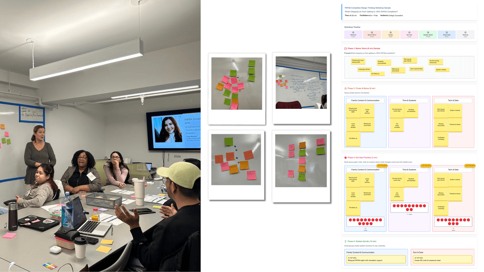
FAFSA Design Jam with college counselors
Counselors named what stops families from finishing the FAFSA, clustered the barriers, and dot-voted where small changes would move the needle most.
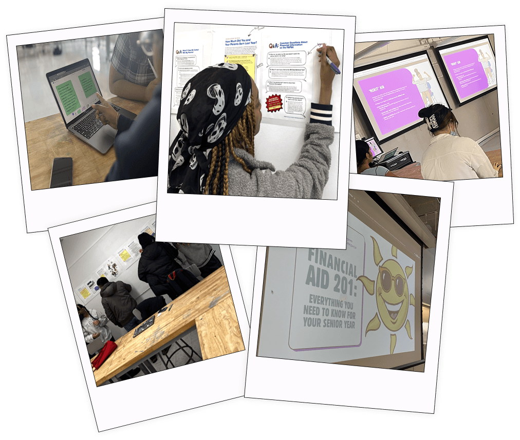
Testing with students
Students worked through live drafts of the site and handouts and marked what confused them right on the page.

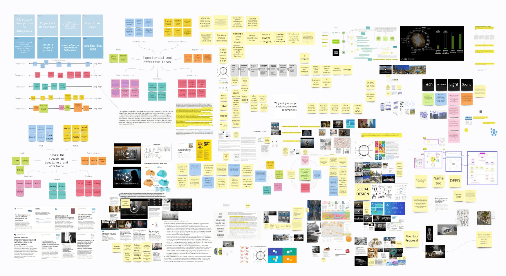
The co-design board in Miro: friction points, advice that already works, and the ideas the advisors voted up.
Open the workshop board ↗
DELIVERABLE
Co-design boards, eight personas, the Does This Land review datasheet
02 · THE 2026 REDESIGN
You told us. Here’s what we built.
The redesign answers the five themes directly. The homepage starts with questions, not menus: four folders, A to D, because “keep everything in a folder” was the most repeated note. Paying for College is regrouped into five journey stages, September to summer. Special Circumstances became Help for Every Family and gained a hub where a student picks their situation and the resources that fit rise to the top, with nothing saved or sent. For Counselors moved to the top bar. Every existing URL stays. WCAG AA throughout, with keyboard navigation, 44px targets and reduced-motion support. Delivered as responsive desktop and mobile builds, a recommended sitemap and a printable walkthrough written for the advisors who shaped it.
FROM THE WORKSHOPS
“Keep everything in a folder!!!”
CUNY advisor, the most repeated note on the board
How the design answered: the homepage is a set of file folders, tabs A to D, and the Docs Box turns the folder into a checklist families can fill before they arrive.

Homepage
Four tabs answer the first question families ask: where do I start.

Help for Every Family
Tells students their situation is common, and that there is still money for college.
Keeping RJ Matson’s illustrations
The guide’s illustrations are by editorial cartoonist RJ Matson, whose work has run in The New York Times. The Center asked me to keep them, and a site full of editorial cartoons can easily feel cluttered. So each illustration got one job: hero art for a section, the picture for a journey stage, or a single spot on a card. They live inside frames and cards, one per card, so the art works as wayfinding instead of decoration.

Where are you in your journey?
Paying for college in five stages, each with its season. Families pick the stage that sounds like them, in any order, and each step opens the guides for that moment.

Special Circumstances hub, filtering by situation
Students pick everything that applies. Resources that fit all of their picks come first, and nothing is saved or sent.

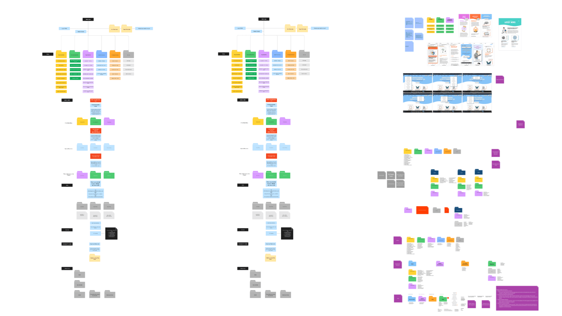
Recommended sitemap
Built from the audit of the current menu. Every page and URL stays. Sections are renamed by need, Paying for College follows the five journey stages, and counselors get one Toolkit hub.
DELIVERABLE
Homepage (desktop and mobile), Special Circumstances Hub, recommended sitemap, CUNY Counselor Walkthrough
03 · THE CONTRIBUTOR DECISION TREE
Who fills out the FAFSA? Four questions, one answer
Counselors said the one-page handout they wanted most was the decision tree, because it is visual. The question it answers, which parent goes on the form, is the one families get wrong most. So the tree became a product: one question at a time, each answer drawn as a step on the path, and a modular node graph so new branches such as Tricky Taxes scenarios can be added without a rebuild. Single-file HTML, no dependencies, embeds anywhere. Try it below.
FROM THE WORKSHOPS
“Not knowing the dynamics of who is the contributor in regards to taxes and financial support.”
CUNY advisor, friction point on the co-design board
How the design answered: the tree turns that question into a few yes or no steps. A family answers one at a time and lands on exactly which parent fills out the FAFSA.
↓ Interactive prototype below. Click Yes or No to play.
DELIVERABLE
FAFSA Contributor Decision Tree, single-file HTML, credited to the CUNY Fellows
04 · THE FINANCIAL AID CARD GAME
Am I eligible? The answer is always yes
Ten cards, each a real situation: a DACA recipient, a refugee with an I-94, a student still learning English, a family that makes a lot of money. Reveal the answer, then a “think about it” question turns the card into a conversation instead of a score. Built for a class or a one-on-one and co-branded with Internationals Network, on the guide’s core message: every student is eligible for something. Play a round below.
FROM THE WORKSHOPS
“Games are fun but sometimes they get carried away with it being a game vs retaining info.”
CUNY advisor, sticky note that gave the game its think-about-it prompt
How the design answered: no points and no score. Every card ends with a “think about it” question, so the game turns into a conversation about the rule instead of a race.
↓ Interactive prototype below. Pick a card and click Reveal answer.
DELIVERABLE
Financial Aid Card Game, ten scenarios, single-file HTML
05 · DOCS BOX AND VISA BOX
The two hardest pieces to ship, in print
Counselors asked for a simple bilingual checklist of what to bring to a FAFSA event, and named “not knowing their status or social security” as the hardest moment. I made these two print pieces with Norma Feriz-Gordon at NYC Public Schools and with Internationals Network, and tested every draft in document reviews with their counselors. The clearest feedback was about pictures. Clean icons looked good, but parents and students could not match a drawing to the paper in their hand, and students kept bringing in the wrong card. So the Docs Box shows every document as a real image, and the Visa Box names each one by its exact form number. Every line also had to work for three audiences at once: families who may not know their own status, counselors who cannot give legal advice, and reviewers who will not sign off on a claim that is not sourced. Both went through proofreading, immigration lawyer review and DOE and partner approval before they shipped as tagged, WCAG AA print PDFs.
FROM THE WORKSHOPS
“My biggest feedback was more pictures. Every single thing that there could be a picture for.”
Counselor, Docs Box and Visa Box document review
How the design answered: a real photo of every document and its exact form number, so families can match the paper in their hand.

Docs Box
One page. Every document a family may need, shown as a photo of the real paper, with one line on why it matters.

Visa Box, page 1
Status by status: who qualifies for federal aid, the exact documents to bring by form number, and what to know.

Visa Box, page 2
When federal aid is off the table: state, college and private aid, the NYS DREAM Act, and the visas that qualify for neither.
DELIVERABLE
Docs Box and Visa Box, tagged WCAG AA print PDFs, made with NYC Public Schools and Internationals Network
PAGES AND GAMES FROM PREVIOUS YEARS · 2023 TO 2025
Before the redesign: the live site and the first two tools
Everything above is the 2026 work. Below is what it built on: the live site as it stood before the redesign, and the State Funding Map and Bill Comparison Tool, the two tools that answer the questions families ask first.
The State Funding Map lets students explore local FAFSA and grant deadlines by state. Designed through systems mapping, it pulls fragmented policy information into one view. Since launch it has helped thousands of users find on-time aid opportunities, reducing missed deadlines and lifting application completion.
The Bill Comparison Tool helps students navigate real college cost scenarios side by side. Co-developed with first-generation students, it simplifies financial data and keeps generating insights that feed back into content clarity and decision support. It sits alongside the Bill Estimator, which answers the question families ask first: what will a year really cost?